Project Collection
Organic Squid Ink
Farfalle Packaging


Overview
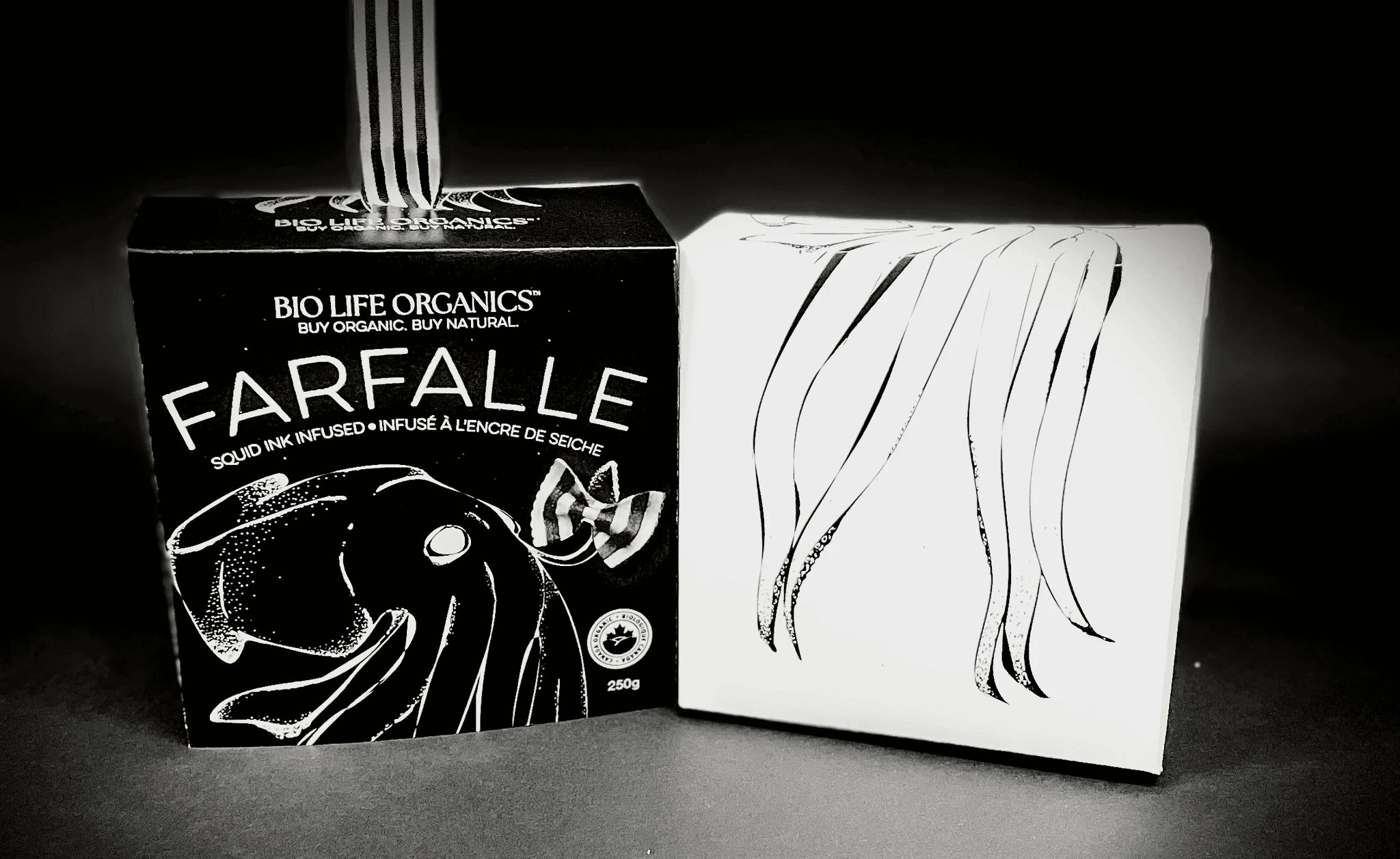
I created a premium design for Bio Life Organics, and my focus was on squid ink farfalle—an unconventional yet elegant product that allowed me to push both visual and conceptual boundaries. The core of the design centers around the dramatic, all-black box, which both reflects the squid ink ingredient and establishes a bold, luxe presence on the shelf.
Approach
I designed premium packaging for Bio Life Organics’ squid ink farfalle—a distinctive product that allowed for exploration of both visual and conceptual boundaries. The design centers around a matte black box, chosen to reflect the deep color of squid ink while establishing a strong, high-end shelf presence.
A hand-drawn, stylized squid wraps around the front of the box, holding a piece of farfalle in its tentacles. This illustration functions as both a visual anchor and a direct connection to the main ingredient. The use of hand-drawn elements throughout the design brings an artisanal feel that complements the product’s organic roots, softening the bold aesthetic with a sense of craft and care.
To emphasize the uniqueness of the pasta, the farfalle is given a subtle glowing effect. This glow, echoed in the typography, helps draw attention to the product and creates a sense of delicacy and refinement. Tiny white and black specks scattered across the box represent deep-sea bioluminescence—tying the visual language back to the squid’s natural environment.
While the overall look is clean and premium, care was taken to maintain the organic identity of the brand. The balance between the glowing, modern accents and the textured, hand-rendered elements helps reinforce that this is a natural product with a strong sense of origin. A simple serif typeface is used for body copy to keep the tone grounded and readable.
The packaging copy reinforces the product’s heritage and values, describing the farfalle as a “tradition of purity—fresh ink, responsibly sourced, and naturally rich in flavor.” This positions the pasta not just as a specialty item, but as part of a larger story rooted in Mediterranean culinary tradition and responsible food sourcing.
Overall, the packaging aims to highlight the contrast that defines the product itself—striking yet simple, elevated yet honest.
DOSKA 2025